Crafting the Perfect Father’s Day Color Palette Using Color Theory

Designing a memorable Father’s Day color palette starts with understanding how color theory can evoke emotion and meaning. The right combination of colors not only enhances visual appeal but also reflects the values and sentiments we associate with fatherhood.
Here’s a thoughtfully curated color palette for Father’s Day, along with the symbolism behind each choice:
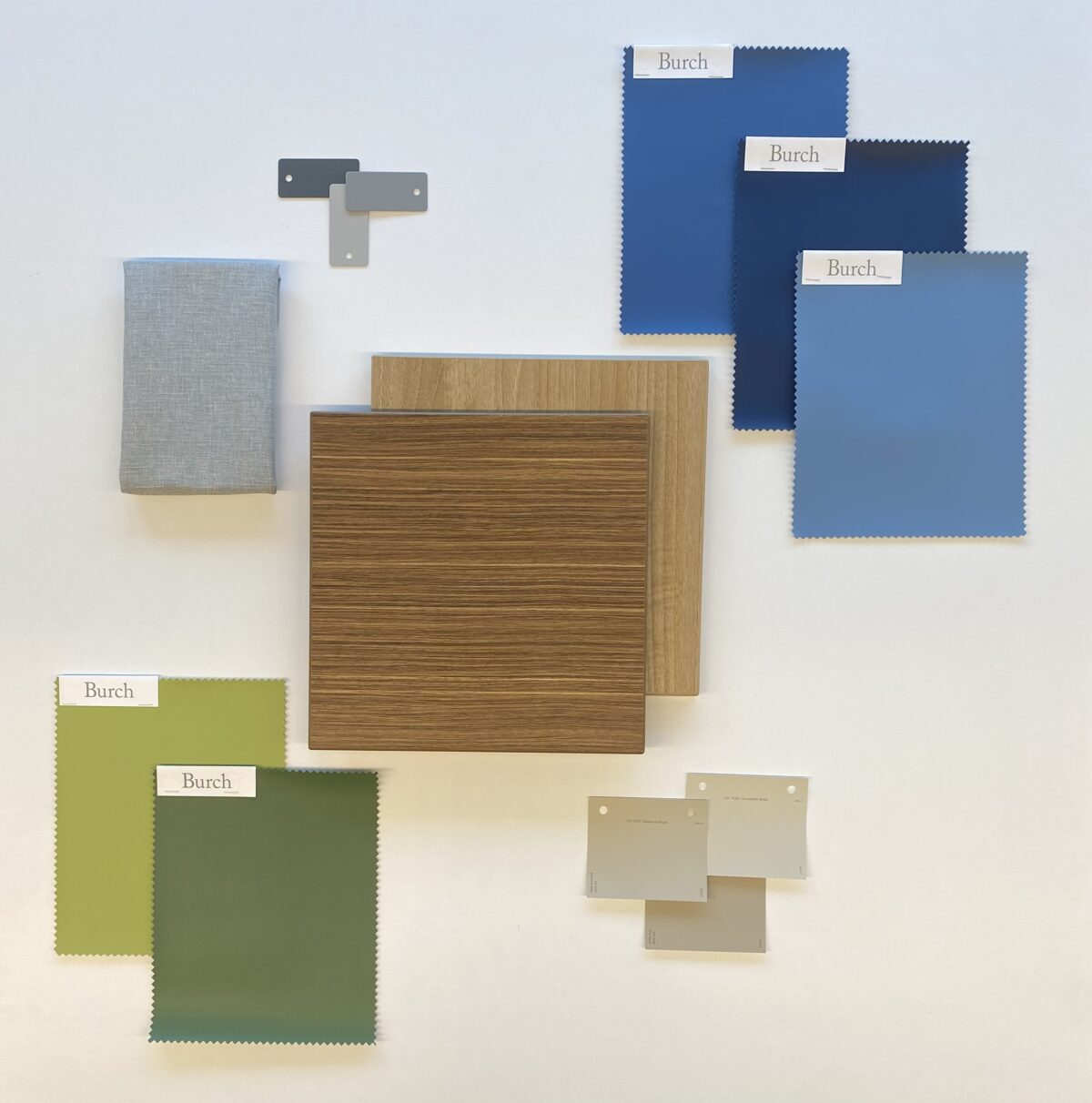
1. Navy Blue
Symbolism: Trust, loyalty, wisdom, confidence
Why it works: Navy blue is often linked to dependability and strength qualities that define many father figures.
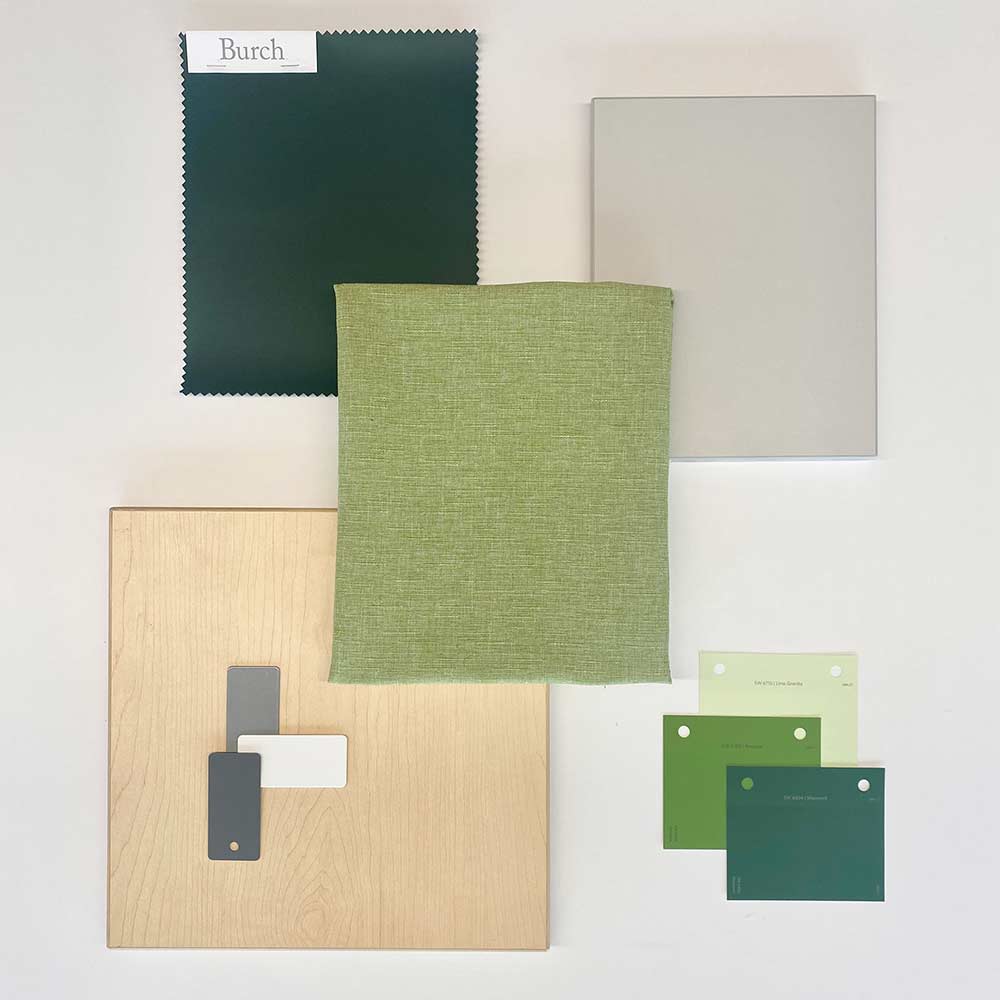
2. Olive Green
Symbolism: Growth, harmony, safety
Why it works: This earthy tone conveys a nurturing, grounded presence, representing a father’s protective nature.
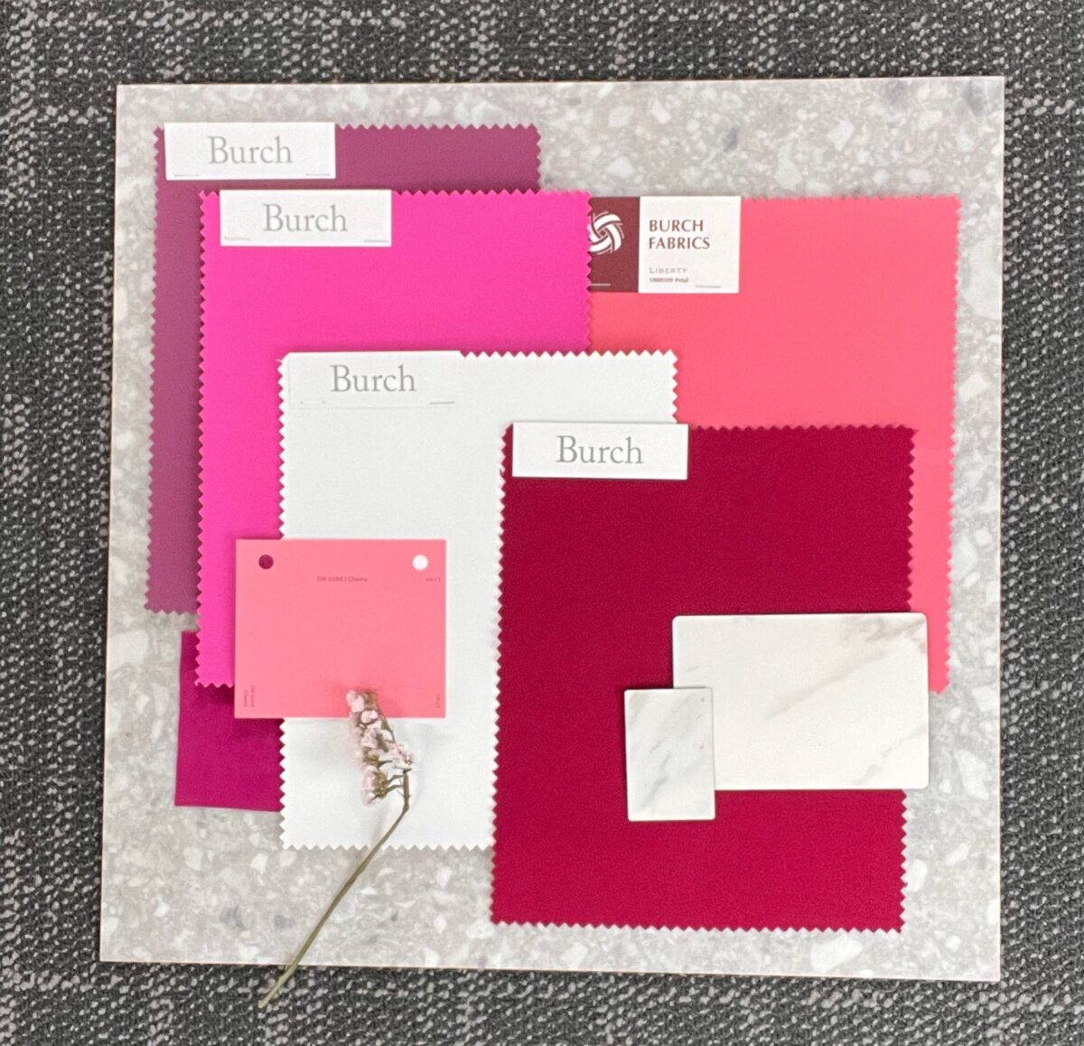
3. Burgundy
Symbolism: Strength, elegance, leadership
Why it works: A deep red like burgundy adds emotional depth and sophistication, reflecting a father’s caring heart and strong leadership.
4. Warm Grey
Symbolism: Neutrality, balance, calm
Why it works: This mature, steady shade acts as a grounding color, balancing the more vibrant tones in your design.
5. Burnt Orange
Symbolism: Enthusiasm, warmth, energy
Why it works: Burnt orange brings vibrancy and energy, symbolizing the spirited joy fathers bring to their families.
6. Ivory
Symbolism: Purity, simplicity, calm
Why it works: A soft ivory background allows other colors to shine while maintaining a clean, refined aesthetic.
Conclusion:
Using color theory to design a Father’s Day color palette helps communicate emotion and purpose. Whether for branding, gift design, or digital content, this palette offers a rich, balanced mix perfect for honoring fatherhood.


